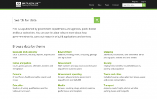
We’re making some changes to how the data.gov.uk homepage looks.
This will help our users to understand what the site is for, what types of data we have, and how they can search the catalogue.
The previous design highlighted open data-related activity, but we know the data itself is what’s most important to our users, so we’re making this the focus of our homepage:

Over 60% of all traffic to data.gov.uk comes via search engines to a specific dataset. So while the homepage is not the primary entry point, it’s still important in helping users to find the data they are after easily. And we think the descriptions of the data themes (which users already use to refine their onsite search) will help them do so.
We think the new layout is simple, makes search easier, and provides a much needed introduction to the site. But we’re not taking that for granted. We’re going to be tracking things such as which search terms are used and which themes are most popular so that we can fine-tune our understanding of user needs as they search for data. This is something we’ve not always done that well in the past.
Data.gov.uk is undergoing a discovery to better understand user needs and assess how they might have evolved since the site was first created. Our findings will help us design our services so that we make it even easier for users to find government data.
We’ll be blogging about our discovery in the next few weeks. In the meantime we’d love to hear your feedback on the new homepage.
Recent Comments