We are now open for applications to the next round of the Data Science Accelerator, so it’s a good moment to give a flavour of the programme based on our most recent graduation. This was the sixth cohort to go through the programme, with 10 participants using data science approaches to tackle real business problems relevant to their departments.
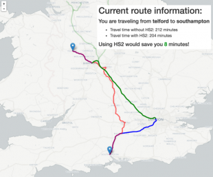
Jonathan Brown - High Speed 2 (HS2)
Jonathan made a Python web application which shows how HS2 will cut journey times between any two locations in the UK. This is really useful, because users are likely to be more interested in HS2’s effect on their personal journey than overall statistics. HS2 are really pleased by the project and plan to publish Jonathan’s work.
Martin Griffiths - OFSTED
Martin's project looked at Ofsted's risk assessment of schools: predicting future inspection results on the basis of school performance data. He investigated machine learning techniques such as Random Forests, training the model on the previous year's inspection results, producing a model with 75-80% accuracy on test data. The model will be used as a cross-check on this year’s risk assessment process.
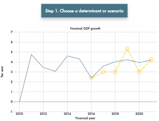
Harriet Price - Office for Budget Responsibility (OBR)
The OBR produces forecasts for the economy, tax receipts and government spending. They show whether the Chancellor of the Exchequer is likely to meet the fiscal targets, so there’s lots of interest from journalists, politicians and the public.
To illustrate the uncertainty around the forecast, OBR produces ready reckoners which calculate a typical direct impact in the public finances after a change in the economy. Previously, these were presented in an annex at the back of one of their publications, but Harriet has produced a D3 javascript app for the public to explore for themselves how key economic factors can affect government finances.
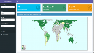
David Lee - Defra
David’s project was about targeting markets and products for food and drink exports. The UK Trade and Investment (UKTI) food and drink team do this each year so that they can plan their business and evaluate their campaign and advisory activity. David made a Shiny dashboard to analyse and visualise trade data - there is much more to do but during the Accelerator he went from data acquisition and cleansing to analysis and visualisation - it was an invaluable experience.
Anna Christie - Public Health England
Health assets are ‘the collective resources which individuals and communities have at their disposal, which protect against negative health outcomes and promote health status. They can be social, financial, physical, environmental, or human resources, e.g. employment, education, and supportive social networks’. Anna made a web application to show the strength of community assets within each local authority.
The web application allows you to select a local authority and see a zoomable treemap summarising its health indicators. The top layer of the treemap shows the assets grouped by theme (e.g. the economy or natural environment). You can then drill into a theme and the size of the boxes shows each asset’s weighted national rank, letting the user see which are strongest, and see accompanying text about how they affect health.
Ed Sherman - Department for Education
Large, linked administrative datasets are increasingly available in education. They now need to be analysed to inform better decisions by government and individuals. Ed’s project analysed what jobs people got after taking part in Further Education over a 10 year period. Ed rebuilt a dataset previously analysed by contractors, bringing the capability in-house. He showcased ‘proof-of-concept’ outputs that could also be applied to larger, less structured datasets. Using SQL and R he can now produce new statistical analysis (e.g. on apprenticeships) and D3 visualisations showing the complexity of learners’ paths through Further Education.
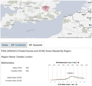
Chris Morriss - Department for Education
Chris developed a web app to visualise the relationship between international PISA scores and GCSE results in mathematics and reading from 2009 and 2012. The app uses Google Maps, JavaScript and Highcharts to make a regional comparison. The app is still in development and will be used to better understand the relationship between GCSE and PISA, including any systematic differences between them.
George Davies - Land Registry
George worked with semi-structured “Register of Title” data from Land Registry. He worked on creating rules for making a leasehold dataset. These identify cross-references between textual register entries. He will produce a network viewer allowing this complexity to be explored, and take his experience out via “show and tells” to a variety of groups in the Land Registry to explore how data science could help them with their tactical and strategic issues.
Katie Davidson - Department for Health
Katie looked at the key drivers behind poor A&E performance. She found that munging the data for the various types of A&E (minor injuries, specialist and large units) required a lot of work in R. She then built a log regression model, a multilevel mixed effects time series model, and a correlation matrix to investigate which factors were most significant. This shows significant (but not overwhelming) relationships between A&E performance and factors such as weather and number of admissions.
You could be next!
We are open for applications to the next round of the Accelerator. Further details are in our launch blog and the application deadline is 3 February!
1 comment
Comment by Jason posted on
I'd be interested to see a heatmap (or isochron lines?) of time-saved-by-HS2 across the country